When deciding which color grading tools are safe or problematic, there are generally three approaches:
- The Experimentalist: Evaluate the tool on many images and play with the parameters
- The Theorist: Understand the math behind the tool and evaluate whether it works based on first principles alone
- The Benchmarker: Run the tool on some synthetic benchmark charts and evaluate performance on those
The Experimentalist has the downside that it takes a long time to evaluate any given tool and the Theorist is handicapped by the fact that many tools do not disclose their implementation details. The Benchmarker is uniquely equipped to both quickly discard many operations, and evaluate black box tools. In this article, we will look into how to best use synthetic charts for color tool evaluation.
All synthetic charts described in this article are available for free here:
Contents
- Why does smoothness matter?
- But first: What color space is a synthetic chart?
- Exposure Chart and Gray Ramps
- Smoothness Charts
- Other Charts
- What else is there?
Why does smoothness matter?
I first ran into smoothness issues when developing operations that intended to reduce the brightness of more “saturated” or “pure” colors. In the below triple of images, the first image is the input image, and the second and third images are two different operations that intend to darken the more saturated colors.
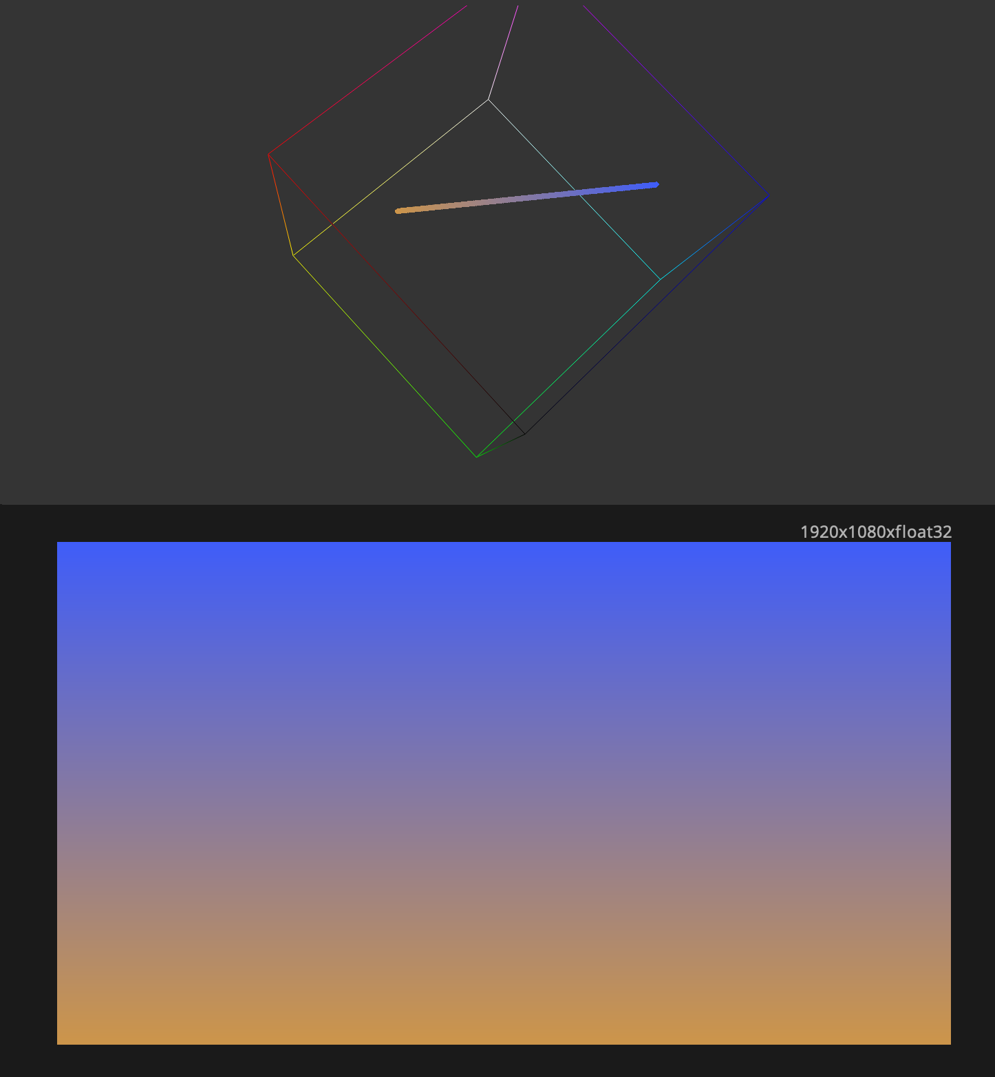
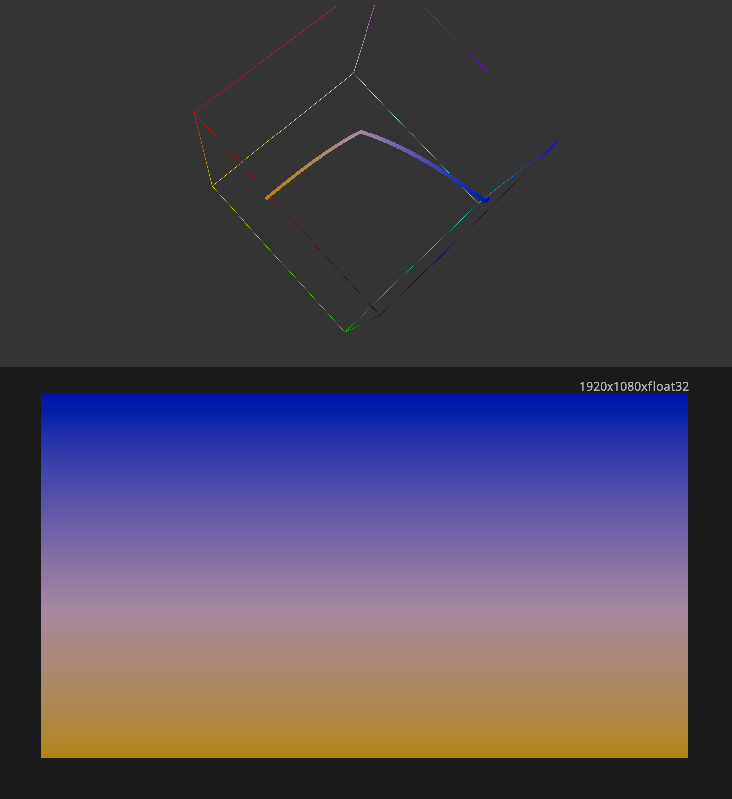
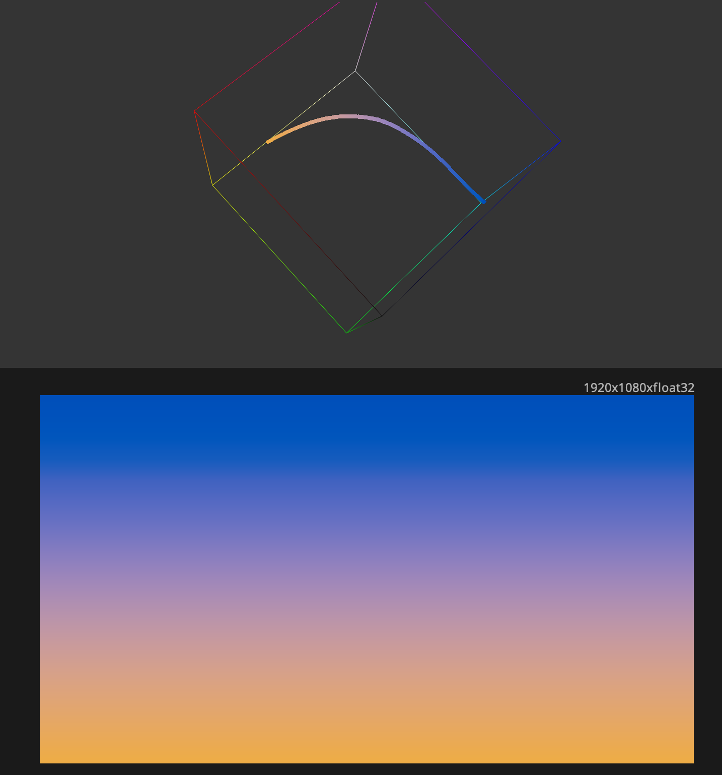
We observe that the second image has a visible horizontal edge across the middle of the gradient, whereas this edge disappears in the third image1. Note that this edge correlates with the fold in the curve in the 3D histogram.
Clearly, if you have an image that as-photographed did not have an edge in a certain place, then introducing an edge in the color grade would be a mistake. In general, it is a mistake for a colorist or compositor to introduce any kind of cognitive dissonance into an image, where the viewer perceives a relationship between things that differs from the physical spatial relationship of the objects photographed.
But first: What color space is a synthetic chart?
Suppose we were to generate a red frame solely consisting of code values of \((1, 0, 0)\). The color space of this triplet is arbitrary; the xy chromaticity coordinate corresponding to that code value depends solely on the color space you assign to it.
In general, the color space of our red asset is inherited by the assumed color space of the image at the point where the synthetic chart is generated and read by the following steps in the pipeline. IE if you were to take our pure red texture and send it through the Arri LogC3 to Rec709 LUT, then you’re saying that the red is a 100% red in Arri LogC3/AWG3. If you’re doing a matte painting and you paint this pure red atop an SRGB image, then you’re implicitely saying that it’s an SRGB pure red.
Some color charts generate code values that have certain known relationships to other code values within the chart. It’s important to be mindful of these constraints and ensure that the chart is being used in a way that those relationships are meaningful, if you want to derive the correct conclusions.
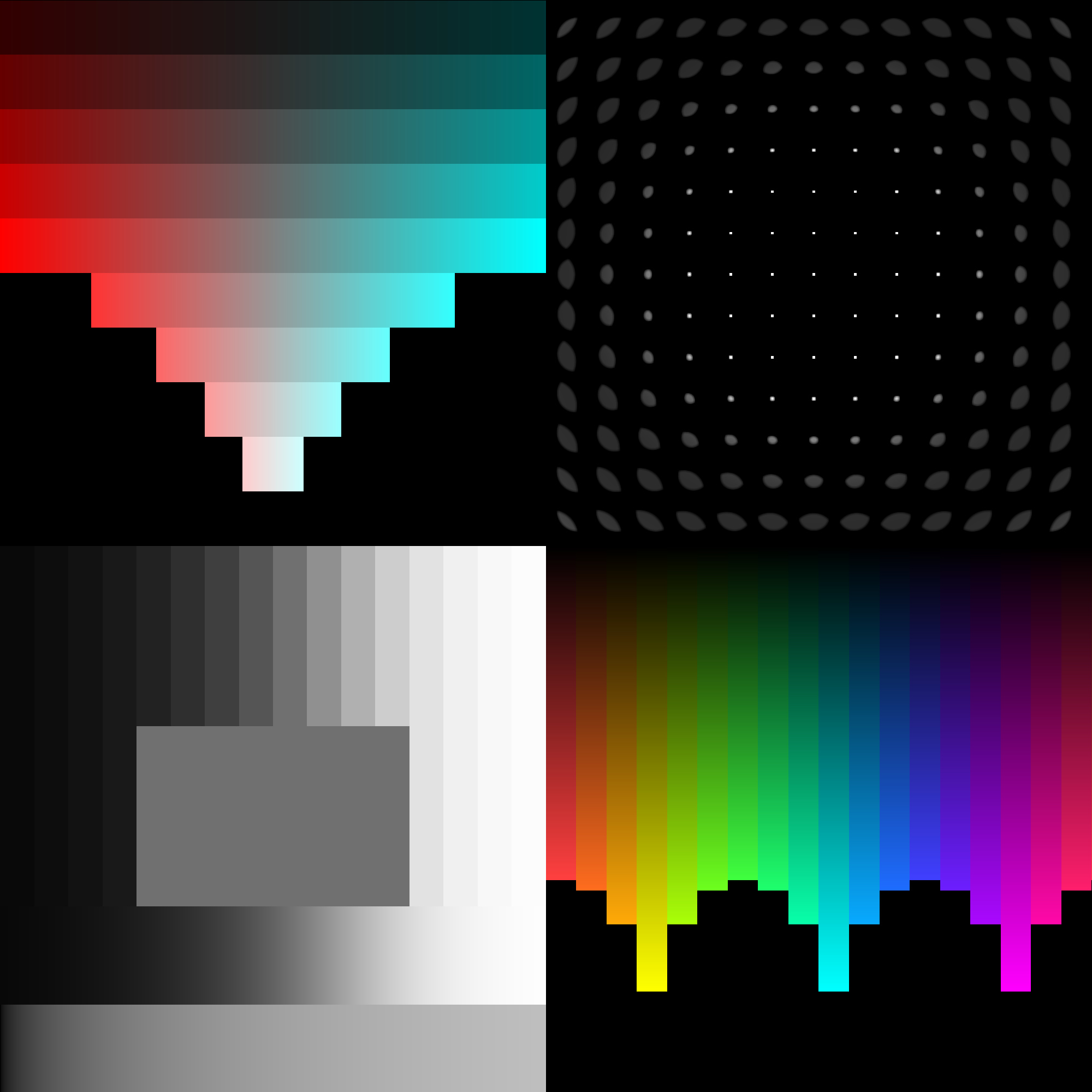
Exposure Chart and Gray Ramps
The first synthetic chart most people interact with is a linear ramp, that goes from \((0, 0, 0)\) on the left to \((1, 1, 1)\) on the right, with the code value being determined solely by the X-coordinate in the frame.

The main use-case of this sort of chart is to identify the set of 1D curves that would reproduce some operation’s behavior on achromatic colors.
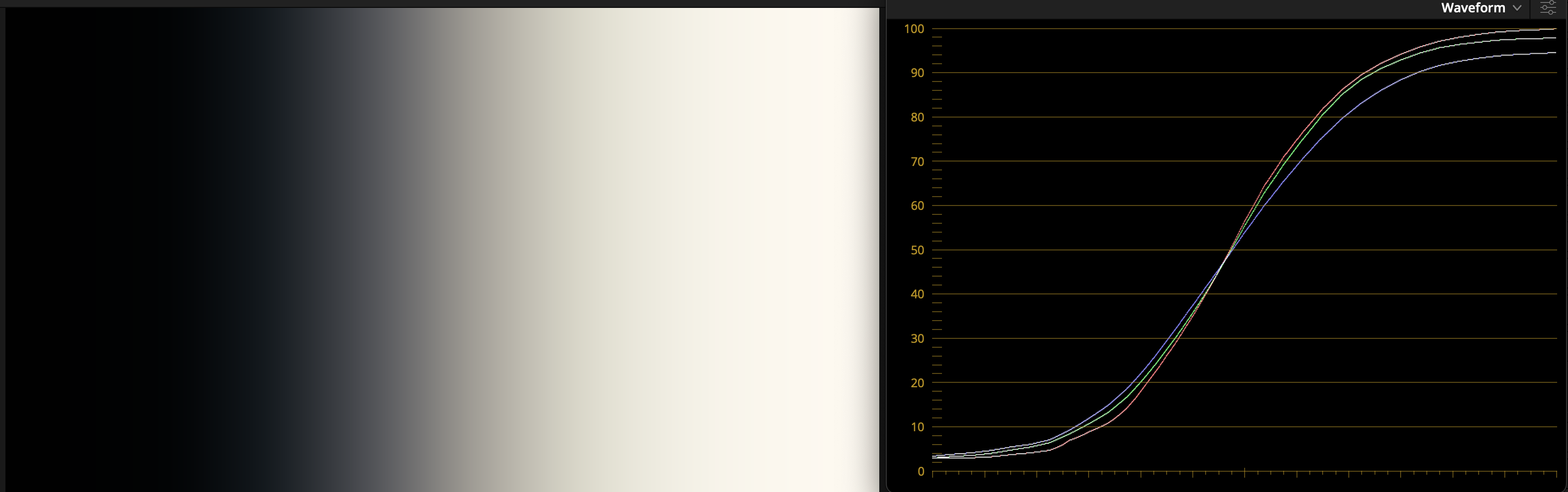
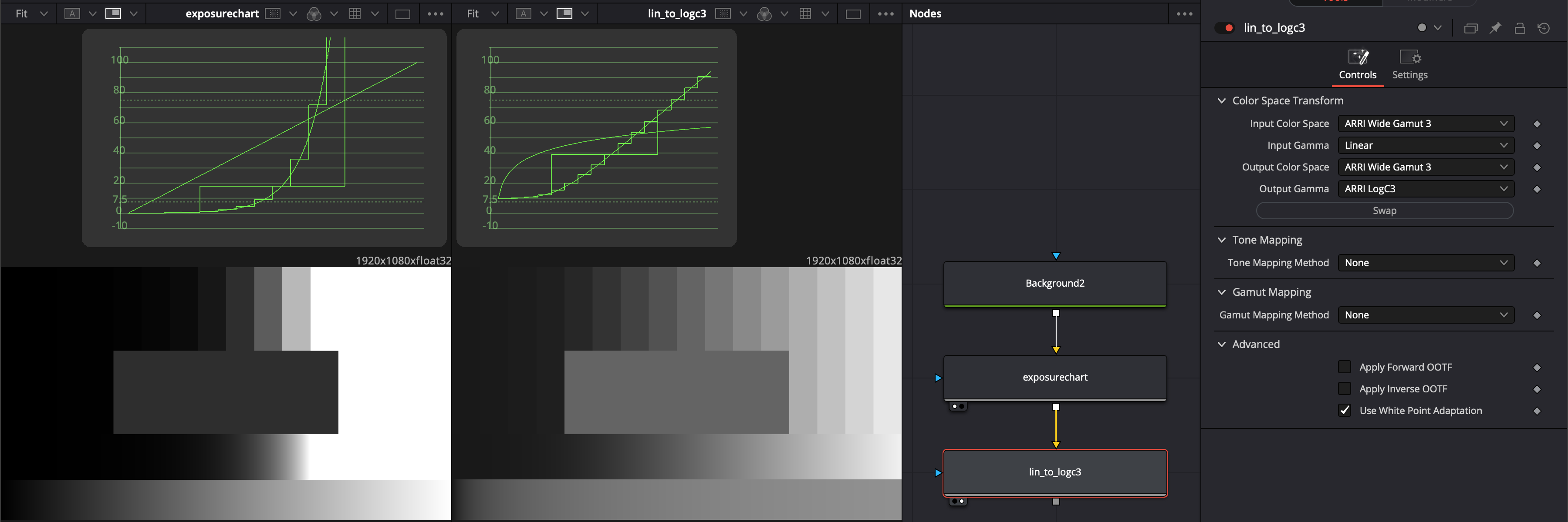
While this chart is useful for understanding what a LUT or other tool is doing, it’s not necessarily useful in a scene-referred context where we want to understand the behavior of a tool for increasing stops of light. That’s why I made (with heavy inspiration from a chart demonstrated by Walter Volpatto and another by Cullen Kelly) an exposure chart to improve visibility on this. This chart generates swatches where each one’s code value is double the previous, representing a one-stop increase in exposure in linear light. As a result, the chart should be interpreted as scene linear code values and be used as such. This means you may want to transform from this scene linear space to a log encoding if that is what is expected by the tool or pipeline you’re going to test, downstream.
Smoothness Charts
When developing tools, in addition to making sure the tool is useful on real photography, I also ensure that it behaves well on the synthetic charts. As in the example towards the start of the article, the goal is that smooth contours and gradients remain smoothly shaped after the operations in question.
Gradient Smoothness Chart
The first chart to cover generates straight lines on a single plane. With the default parameters on the left, all lines connect pairs of complementary colors, in one-stop (2x) increments. With the Continuous Mode set to “Continuous Exp” on the right, all lines start from black.
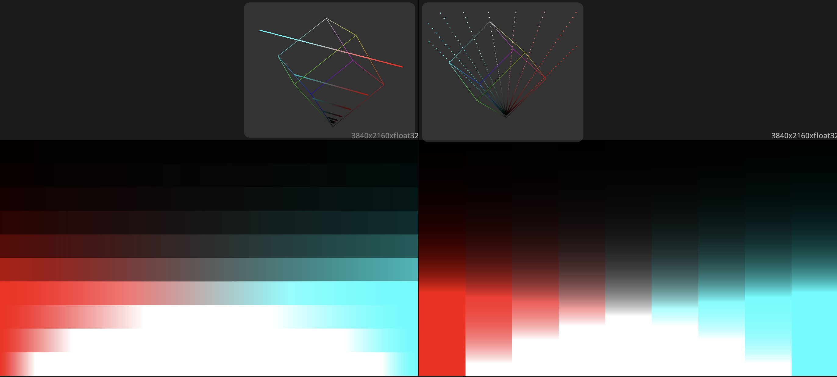
These gradients are somewhat physically plausible because digital photography of out-of-focus colors, motion blur, and sheen often contain gradients that are a straight line in the 3D Histogram, when viewed in linear. The synthetic chart should be considered scene linear, and you should transform to your working log encoding if needed.
RGB Chips Chart
This chart generates a hue sweep for a given saturation in either HSV or Spherical color models, in one-stop (2x) increments. When drawn in spherical, the hue sweep traces a circle in the 3D histogram as shown on the left. When set to “Continuous Exp”, similarly to the Gradient Smoothness Chart, we generate an exposure sweep of a single hue/saturation for many hues. This chart should be considered a linear image, and is useful in identifying how some hues have skewed or collapsed together though some operation.
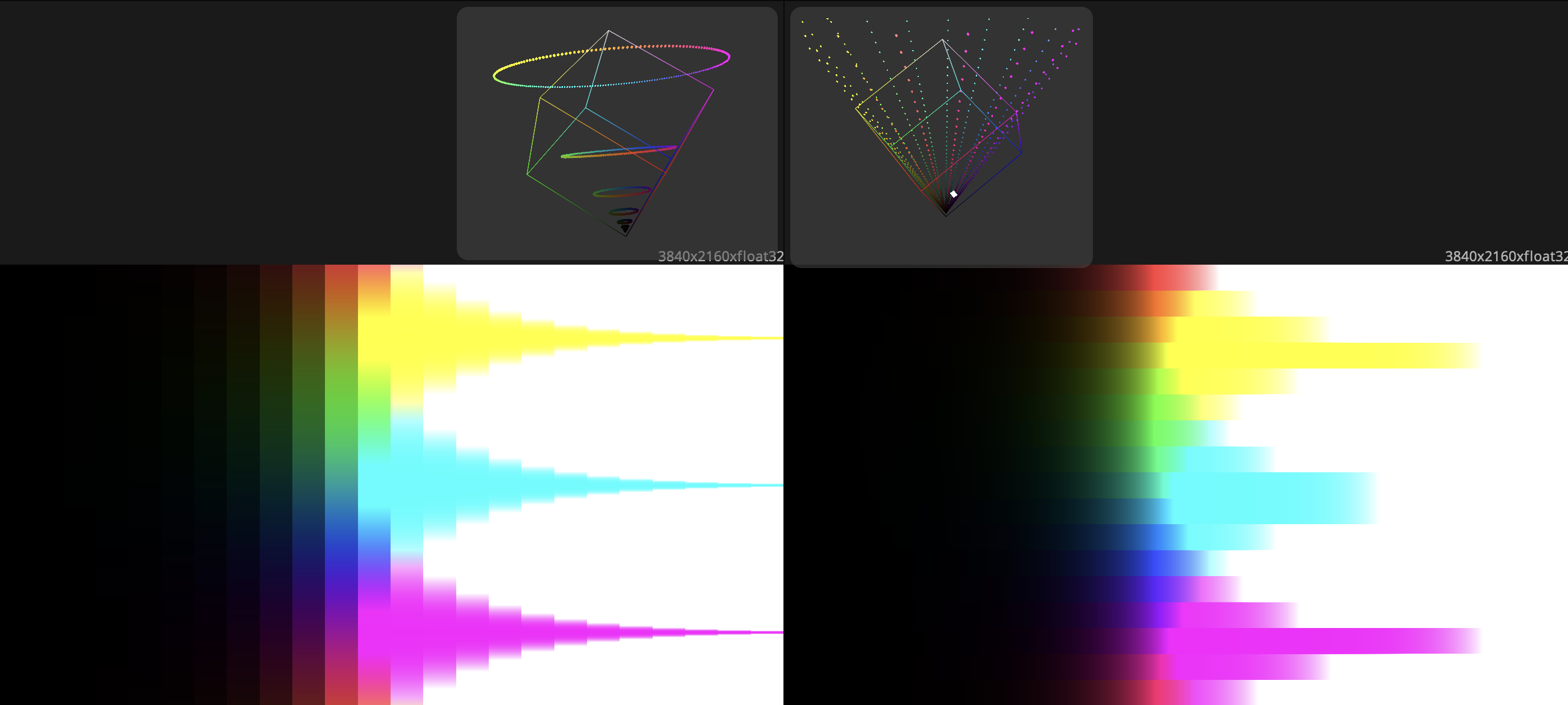
When generating values in HSV mode, at a full saturation, this tool will sample at the outer bounds of the assumed primaries. This may be useful to determine if your pipeline is clipping any information or pushes these nonnegative code values into the negatives.
Other Charts
Grid Chart
This chart is useful for evaluating certain spatial tools, like blur kernels. It simply generates gridlines or dots with a code value of 0.0 or 1.0. The top half illustrates the modes of the chart (dots vs grid) and the bottom half is an example of a blur being applied to the charts.
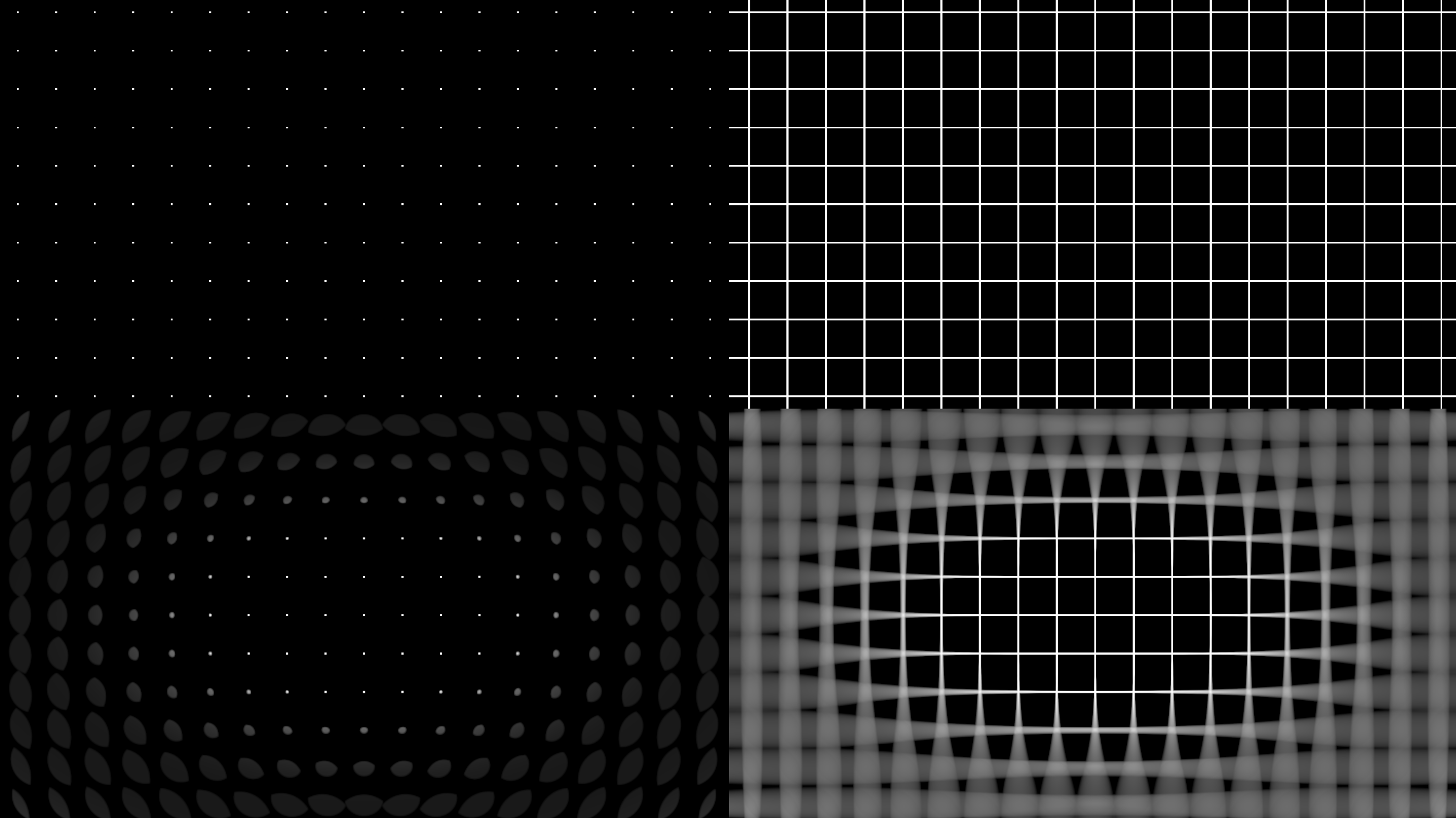
For the bottom two charts, typically lens blur effects should be applied in linear so I treated the synthetic chart as a linear image, applied the blur, and then a gamma 2.2 function for the display. Generally with this chart, a challenge is for the blurred areas to not appear aliased.
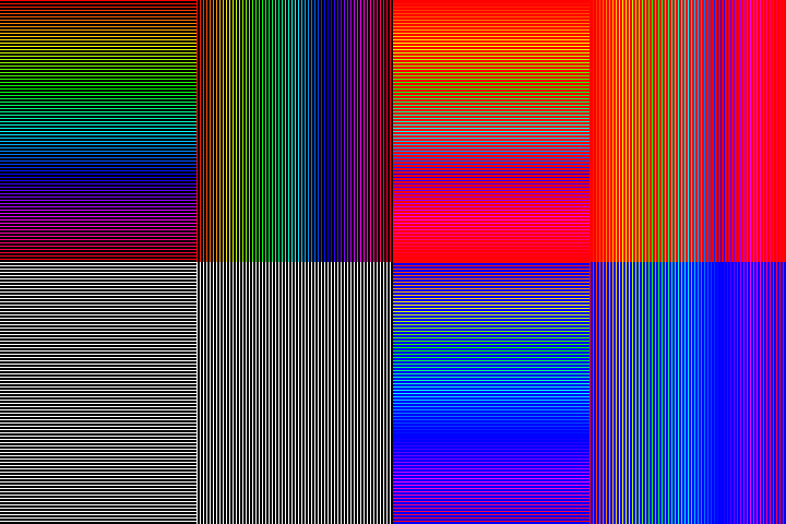
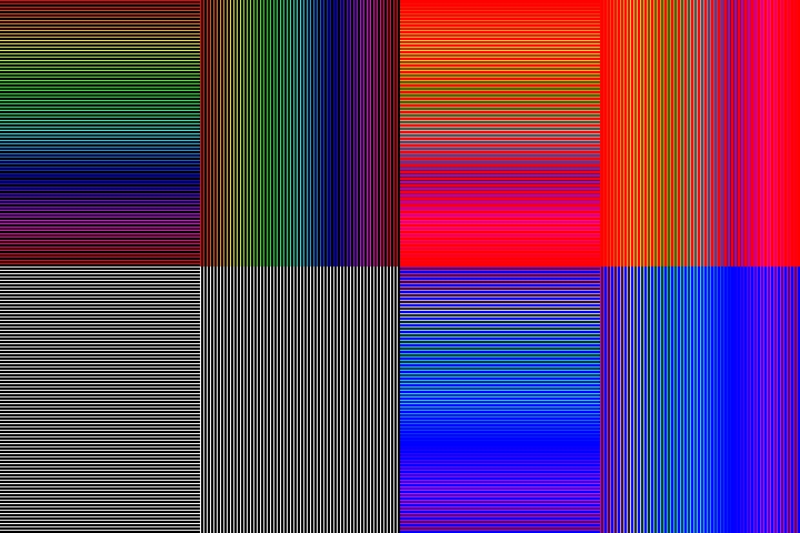
Chroma Subsampling Chart
We can use synthetic charts to identify chroma subsampling in a pipeline. The below left image has no chroma subsampling and the right one is 4:2:0 chroma subsampled by the jpeg encoder in Fusion.
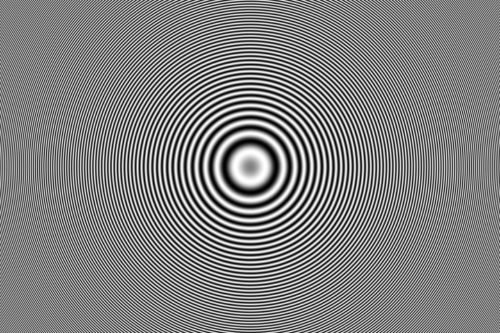
Frequency Chart
This chart draws sinusoids at different frequencies so that we can detect issues caused by resizing artifacts or to test MTF tools.
What else is there?
Even if a tool satisfies all these benchmarks, there is still a genre of error in image mastering in which colors can exceed the threshold of plausible purity established by other stuff in the frame. So far, this appears to be somewhat contextual and challenging to capture in a test chart. That being said, tools that give smooth results on these charts will tend to be more robust in extreme conditions.
-
This is essentially a case of the phenomenon called Mach Bands. ↩